Nexus India is an initiative aimed at empowering local Indian businesses, women entrepreneurs, and welfare organizations by giving them an accessible platform to list, promote, and connect their work with a verified audience.
The Advertisement & Listing Platform is a central component of this ecosystem — designed to let businesses, welfare NGOs, and individual professionals advertise and showcase their services or causes. It also serves as a discovery hub for users who want to find authentic, verified service providers or social initiatives.
My role was to conceptualize and design the complete end-to-end experience for the listing and advertisement module — creating a system that’s inclusive, trustworthy, and easy to use, even for people with minimal digital experience.
India’s small businesses and local initiatives are rich in potential but poor in visibility. Most entrepreneurs rely on personal networks, WhatsApp forwards, or social media posts for promotion — often reaching only a limited audience.
Existing platforms like JustDial or IndiaMART are crowded, complicated, and built primarily for high-volume vendors, leaving smaller players — especially women entrepreneurs and community organizations — feeling invisible.
The challenge was twofold:
I identified three primary user groups and mapped their motivations, challenges, and goals.
They want exposure, leads, and credibility — without having to navigate complex systems or pay for aggressive ad packages.
Pain points:
Especially in the Animal Welfare sector, these users want visibility for their initiatives — adoption drives, donation campaigns, or awareness programs.
Pain points:
A special segment under Nexus India, this group seeks both exposure and recognition.
Pain points:
“How might we create an inclusive listing and advertising experience that empowers small businesses, women-led ventures, and welfare organizations to connect with audiences authentically — while maintaining trust, simplicity, and transparency?”


One of the early insights was that most small business owners abandon forms that feel intimidating.
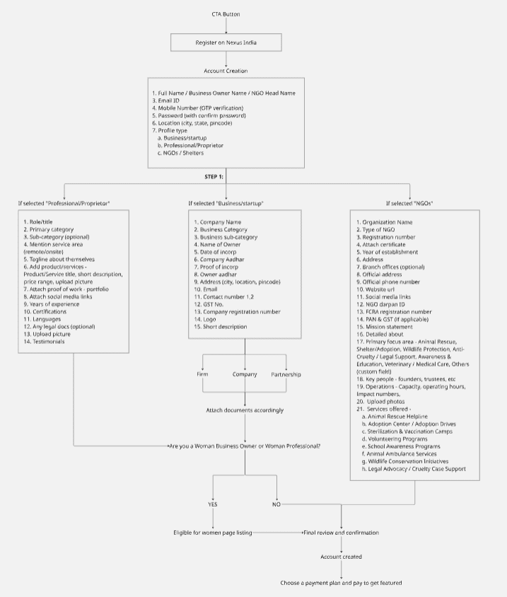
I designed a step-by-step guided registration flow that adapts based on the user type.
For example:
Each step feels conversational and visually guided, making the process less transactional and more supportive.
Instead of traditional pricing tables, the advertisement section was redesigned to communicate value through clarity.
Each ad package is represented visually — showing estimated reach, placement preview, and duration.
Microcopy was crafted to sound empowering rather than salesy, for example:
This approach gives small entrepreneurs confidence in choosing an option that fits their goals — not just their budget.
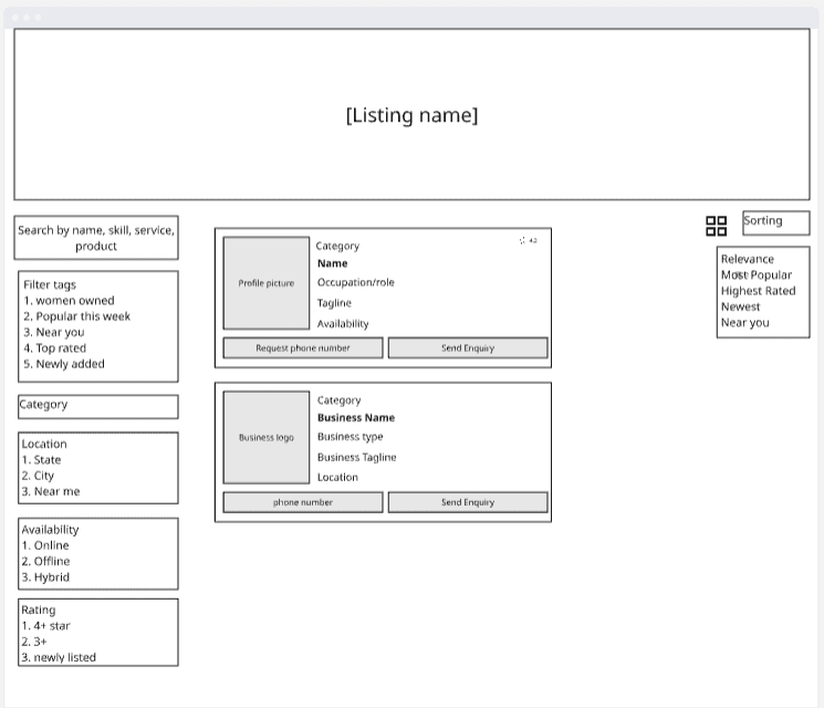
For the user browsing experience, I prioritized search and verification signals.
Listings include:
The overall interface feels clean and human-centered, with attention to detail in visual hierarchy and copy tone.

While the platform is still under development, early stakeholder feedback has been positive.
Business owners and welfare representatives found the flows “simple and human.”
The women entrepreneurship feature was particularly appreciated as a way to promote inclusivity and empowerment.
Once launched, the platform aims to: