A nutritionist coach approached me to design a portfolio website to build her brand and sell personalized nutrition and fitness plans. While the initial website met all functional needs, real-world user testing revealed a major challenge: users struggled to choose a plan due to overwhelming information.
This case study explores how I tackled this issue through user research, journey mapping, and information architecture improvements, ultimately leading to a simpler, more effective plan selection experience.
She provided reference websites, and I conducted a competitive analysis of other nutritionist and fitness coaching platforms. Based on these insights, I structured the website with:
Once we finalized the structure, I created a mood board to define the website’s visual tone and presented wireframes for feedback.
The nutritionist offered 8 different plans, each with 16 unique offerings (e.g., meal plans, grocery lists, unlimited consultations). Some offerings varied based on duration:
To present this, I initially used a grid layout with each plan as a card, detailing features in bullet points. It seemed like a clean, structured approach.
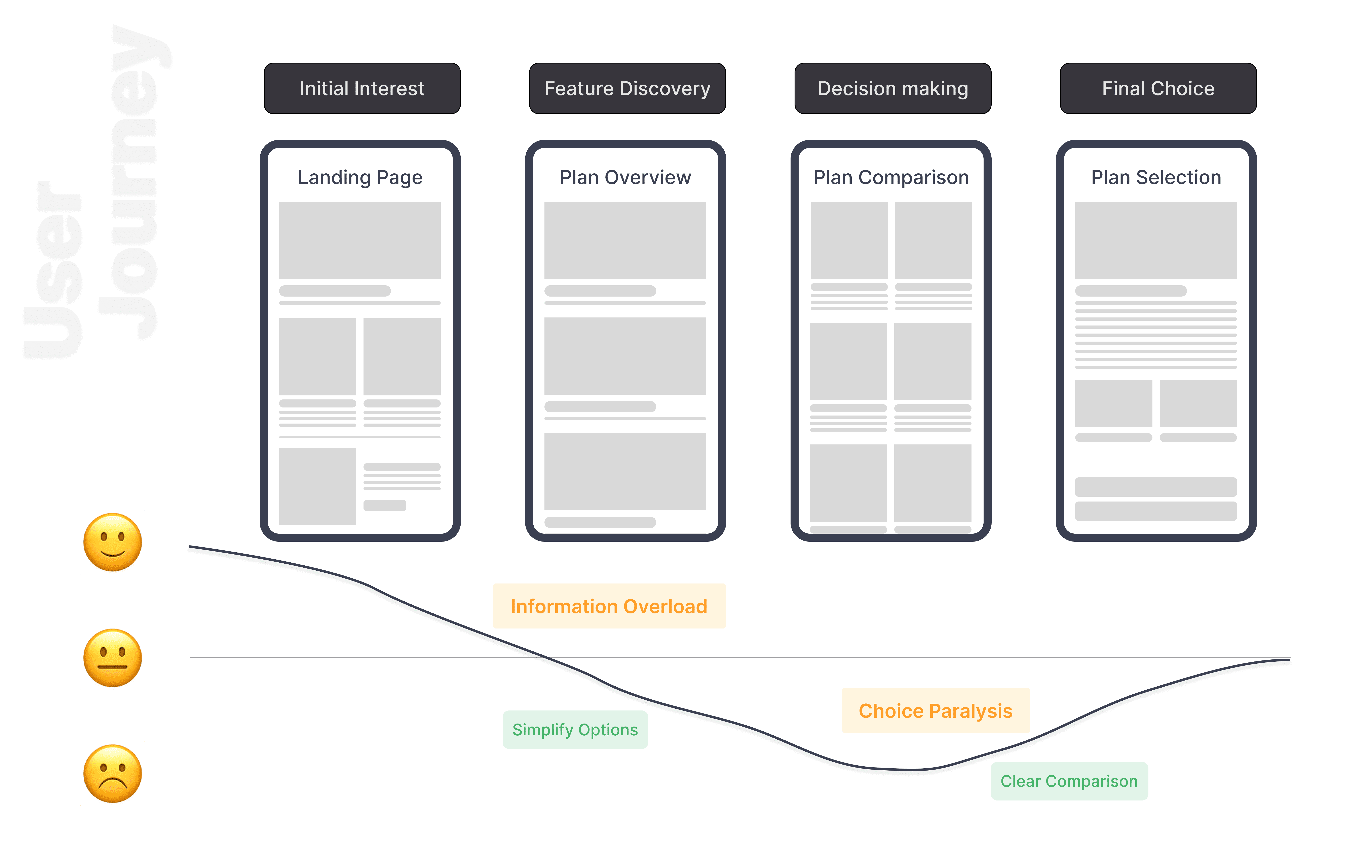
Once the website was live, we conducted a usability test with 12–14 people (friends and family who fit the target audience). We asked them:
“If you were looking for a nutrition and fitness expert, pick a plan for yourself.“
🔎 Observations:
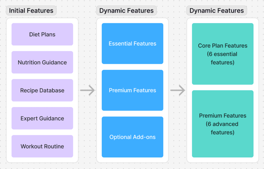
1️⃣ Users felt overwhelmed by the number of plans.
2️⃣ The varying offerings confused them—many couldn’t tell which plan suited them best.
3️⃣ Some users spent over 2 minutes on a single plan page but were still left undecided.
4️⃣ Others abandoned the page midway without exploring all options.
The biggest takeaway? The abundance of choices led to decision paralysis. Users were struggling to process so much information, leading to high drop-offs.
With these insights, I mapped out the user journey to pinpoint where users were getting stuck: entry points, exploration, breakpoints, and exit points.
To simplify the plan structure, I conducted a card sorting exercise with the client. We categorized features based on their value proposition and frequency of use.
Through affinity mapping, we grouped similar features and identified opportunities for consolidation. This process helped us: